3 Simple Design Tips to Better your Site Visuals
Your website is the face of your business. It’s the first thing people see when they search for you, and it’s often the last thing they see before they make a purchase. This makes it absolutely critical to make sure your website looks visually appealing. Fortunately for everyone, there are plenty of design tips you can adhere to that will help you along the way.
Designing website visuals is hard work. It’s a balancing act of art and science, taking into account the user’s needs, the company’s message, and the overall aesthetic. But it’s also a very personal process, and what works for one person might not work for another. That’s why it’s important to find your own design style and to keep things simple.
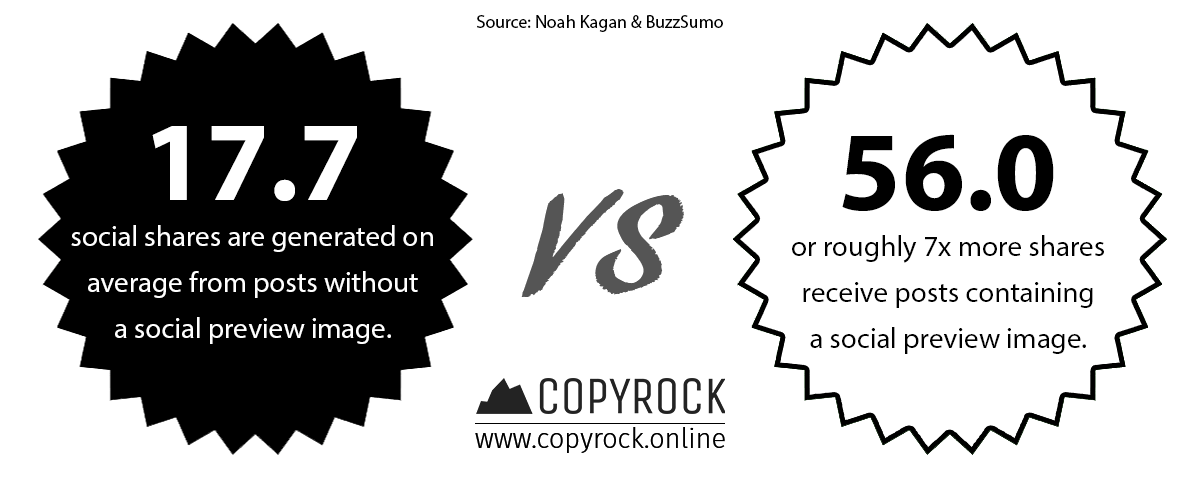
But first a rather rhetorical question – where would a website be without aesthetic visuals to support it? According to research data by Noah Kagan & BuzzSumo, it will most likely remain far from reaching its intended results at the very least. Their findings show that skipping on a social preview image, will hinder social shares by a whopping 7x, or just 17.7 engagements on average instead of 56.

Knowing this gives us plenty of reasons to dig into the details of designing appealing visuals that are not just a pleasure for the eye, but built for engagement around design principles that truly work. And before we start, try to examine our visuals, as you go along the way and you will see these principles in action. So, without further ado here are some simple design tips to help you improve your site visuals:
Eye Movement Design Tips
Before we start putting paint on the canvas, it is essential to think about the composition first. In graphic design, there is a principle called visual hierarchy. Simply put, the visual hierarchy is a reflection of the user’s eye movements when perusing a particular content piece. Being such a vital foundational knowledge, we have selected it to be the first of three design tips we will introduce.
When it comes to the hierarchy itself there are two main patterns that users tend to follow – the “F” pattern – for text-heavy content and the “Z” one – for more visual. Both of these originate from the thousands of years, we have spent reading various texts and because of this can vary, depending on our cultural reading direction. The differences themselves are not radical, but rather classic – for reading left to right and inverse for right to left.
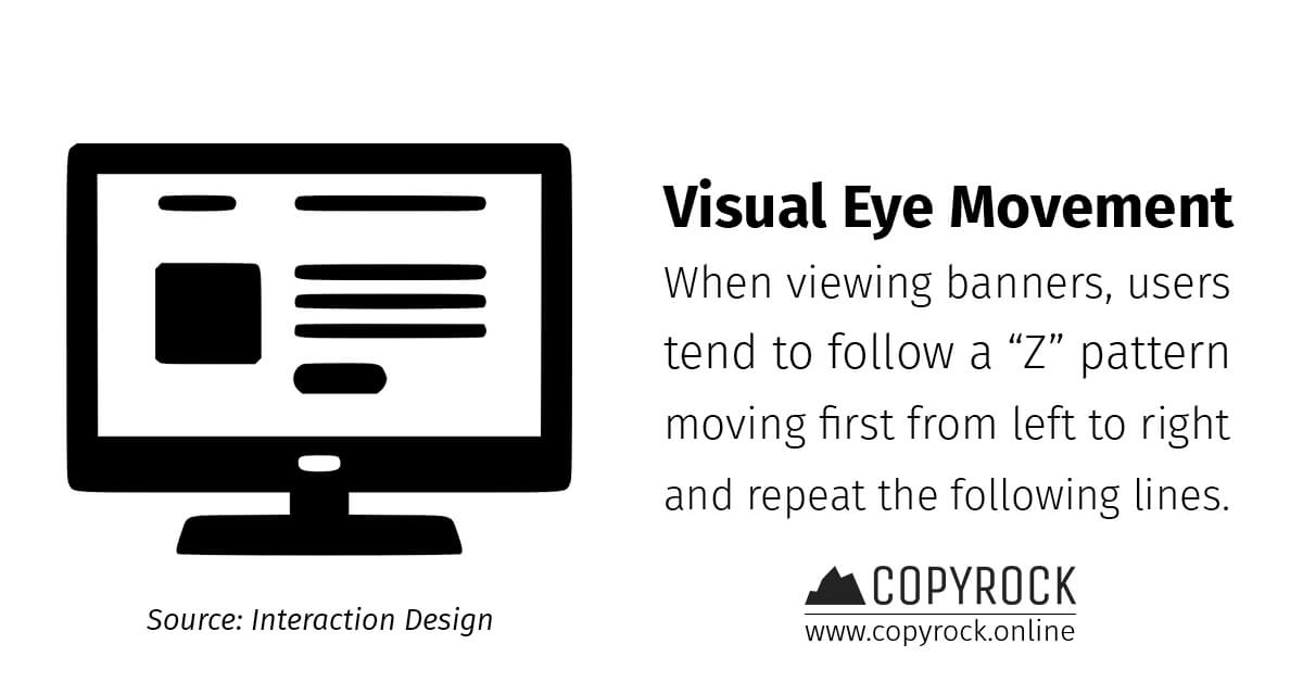
Considering our main focus are the visuals themselves, we will recommend you keep in mind the “Z” pattern when designing banners for example. To better picture this pattern, try splitting a particular visual in four sections – top left, right, as well as bottom left and right. Following this pattern, your user will first see the top left, then move to the right and then move through the bottom sections the same way. To take advantage of this, place an eye-catcher in the top left, followed by a description in the top right.

Design Tips for Typefaces
A typeface is just a fancy graphic design term for the fonts used in a particular content piece. And considering how few of your visuals will be textless, we have put this as #2 in our design tips list. Typefaces are an essential part of any design yet there are plenty of blunders surrounding their use. Using the right typefaces that complement each other is an art and science in itself, which requires its own dedicated article but for now, we will just go over one key factor.
One of the most important things to remember, when using typefaces is to understand that each of the main archetypes conveys a different emotion. While this can sound scary at first, it also creates an incredible opportunity to support your story’s text with a font that further emphasises it. That is why we will take a closer look at the three main typeface categories – serif, sans-serif, and display.
The Serif Typeface
A serif font is one we used to see a lot pre-2010 when most of the content we consumed was delivered by serious traditional companies, like Microsoft for example. That is why the default Microsoft Office font for a long time used to be Times New Roman – a type of serif font, defined by its somewhat ornate design, featuring sharp bevels. This typeface tends to convey a more classic and traditional look, which is best suited for verticals of the same kind like law is.

The Sans-Serif Typeface
In contrast, a sans-serif one does not feature the ornate bevels that typically come with a serif typeface. It was popularised by modern companies, such as Google, and has become one of the identifying marks of contemporary tech. It is clean and easy to read, making it the perfect candidate for long-form text and designs that need to fit a more modern presentation.
The Display Typeface
This category of typefaces is rather broad, as in reality it is composed of several others – script, blackletter, all caps, and everything else fancy. Contrary to popular belief, it is one of the worst typefaces to use for a content piece, as it is difficult to read and is thus best suited just for highlighting and decorative purposes. The old adage “Less is more” applies to this typeface in every conceivable way.
Design Tips for Using Faces
Speaking of typefaces, last on our list of design tips is another key aspect that is referring to… You guessed it – faces! These faces are not the ones that define your text but rather plain old human faces. And keeping in mind how our brains are set up from the thousands of years of experience we have accumulated, it should come as no surprise.
From an early age, humanity’s survival was dependent on being able to identify particular patterns. One of these patterns is of course the human face, as it was a quick and easy to discern friend from foe, like dangerous predators for example. Because of this, our brains respond strongly to the stimuli of seeing a fellow face and perceive it as trustworthy and authoritative, which makes it ripe for you to exploit when designing your visuals.
This makes faces are particularly impactful eye-catcher and naturally there’s a catch to it as well. If you’re looking to make the most significant impression with a face, use one that looks directly into the camera. We’ve all seen those cut-outs that tend to follow you with their gaze whichever side you look at them from and they were used for a reason. There is simply no visual that can be as impressing as that gaze can be.

But there is more. A gaze into the user’s eye is not the only way you can use faces to your advantage. While that is a great tool in itself, line of sight matters just as much. When perusing a particular visual, people tend to follow the line of sight, making it a perfect opportunity to highlight a particular piece of text or another object in the composition.
Bringing it All Together
Bearing these three design tips in mind, you are ready to make your first steps in creating aesthetically pleasing visuals that are just as impactful to your users. You will find these principles or at least some of them at play in each and every visual we have put up on our website. And fortunately for you, the magician’s secret is now out there in the open to take advantage of. Can you make it work for your use case?
Find more frugal marketing and design tips:

Supercharge your Inbound Marketing with CopyRock
- Build a loyal user base and establish yourself as an authority figure in your industry
- Secure a steady flow of immersive and engaging technical content for your audience to love
- Pick the topics that matter to you the most and get high-quality academically researched articles for your blog
- Gain more organic visibility with SEO-optimised content featuring internal links of your choice
Ready to build? Send us your project brief and start building an audience with CopyRock today:
Originally published on CopyRock Insights.
Also available on Medium.
Also available on Pulse.
Also available on TDA Marketplace.


